Tuesday 4 September 2012

Scratch Board

Here's a cool little thing to do that's relatively inexpensive;  Scratchboard.  It comes in many colours, with just as many under-colours, but I really prefer black with white/silver underneath.

It is basically a white poster board that is painted over with black, and you use a little dry fountain-pen type tool to scratch away the black and reveal the lighter colour underneath.  I'm sure there is a PROPER way to do it, but I basically use cross hatching, like a pen and it's incredibly repetitive and very soothing.
It`s a bit hard on teh brain at first, as you`re drawing backwards from what you`re used to.  The more you draw, the whiter it gets, which SHOULDN`T be a difficult concept to wrap your brain around, but after years of making things darker and darker, it really is quite odd.  I also find it very challenging to not be able to sketch out the basic outlines first, because with scratchboard, there is no erasing!  This was my first attempt at RDJ, and meh, not very happy with it.
Here`s the second, which was better, but still not great.  Actually, I kind of lied above.  You CAN sort of erase small mistakes by using a black pen over them, but it doesn`t have the same sheen and texture that the original finsh does, so it`s really more like concealing than erasing.
Oh Bill Murray, I love you so!  It also is a challenge to find a good reference shot.  Even moreso than usual, a picture with a lot of texture and contrast seems to be best suited for this medium.  Scratchboard paper comes in both multi-packs of small sheets and single poster board sized large sheets, and only about five bucks or so per large sheet.  Most of these pics were done on about a quarter or third of a sheet.  I like to draw big. ;)

Wednesday 11 January 2012

Beads, Beads, They're Good For Your Heart

Seed beads.  I got a little idea in my little head, and decided that I wanted to do some portraits with seed beads.  So I went and bought a bead loom and thread, watched some videos on Youtube and made this:
Sadly, the loom was quite narrow, only 23 beads across, so I made it in two sections and them sewed them together.  My reference picture wasn't great, either.  I basically took my pastel drawing of Bernard (from Megamind) and put it through a pixellating filter, then counted across the squares to match the beads.  I also had beads of different opacities, and that didn't help much either.  But I was close!
So I went out and bought beads that were all the same opacity, and I also invested in a computer program that makes cross stitch patterns.  OMG, so damn helpful!  But my loom was still too narrow (and bendy and stretchy) so it still had to be in two pieces.

So I went online and ordered a bigger bead loom!  There are larger ones than this, but I didn't want to hurt my brain too much.  This one is around 120 beads across, almost 100 beads larger than my cheap, crappy original one.

Still using the cross stitch pattern maker, I took a screen shot of Snape from movie 7 and made it monochrome blue.  I also had to tweak it quite a bit.  Seed beads are not square (unlike cross stitches) so the original image has to be stretched waaaay out so that it ends up halfway normal when you're done.  This one is still a bit too tall and skinny.

Here's a better picture of that one, off of the loom.  I'm not quite sure what to do with the finished product.  Sew it on a sweater?  Make a little purse out of it?  I dunno!  For me, it's more in the making than the having.

And finally, with this one I branched out into skin tones.  I had a lot of trouble photographing this one.  The dark beads are quite shiny, and they kept reflecting too much light.  It's actually VERY photo-realistic in real life.

I have big plans for my next bead project.  BIG plans. :D  8mm beads, making a figure that will be about five feet tall.  I'll let you know how it turns out!

Tuesday 13 December 2011

T-shirts and Stickers and iPhones, Oh My!


I decided to try my hand at graphic design.  Wow, it is really different from just regular drawing!  There are a few different 'Shirt sites' that let you submit designs, and dependent on votes, they may or may not get printed.  I think that part of my problem is that I don't do a lot of digital work, but many of the shirt sites require that all art submitted be colour separated.  Not something you can really do with pencil crayons!


Not to mention, I'm very used to letting my art drift out of frame, and generally, for graphics, it has to be centered and complete.  This really hurt my little art brain!

Woot! has a weekly 'theme' and you must submit for that theme and follow any rules (ie: no text, or no turtles) for their derby.  The theme for these past two shirts was Back To School.  No text allowed, but incidental writing is okay.  Sadly, Whoot! does not allow bathroom humour, so there goes PRETTY MUCH ANY IDEAS I could come up with.


The next week was Dogs.  Not text allowed.  I came up with these.  First one is Faithful Shepherd.

This one was Mauraders.  Needless to say, nothing I've made has been printed.  *sad face*  I do see a lot of improvement in my designs though, and that alone is worth the effort.  I don't think I'll quit my (non-paying) job as a fanartist, but these were fun to make, and now many of them are for sale at my own Redbubble store.  Some as iPhone cases, some as shrits, and many as stickers,

I'm still designing, and spending some time re-working stuff that is vague enough to slip under the copyright radar.  Dreamworks doesn't own the rights on Blue Hands, do they?? ;) 

I must say, graphics has been fun, and has really worked my brain in ways that regular fanart hasn't.  I look forward to making more.

Links to some shirt sites that you might want to try.  Let's hope you have better luck than me! :D
Woot!  http://shirt.woot.com/Derby/
Threadless: http://www.threadless.com/submissions

Tuesday 26 July 2011

Show, Don't Tell.

Expressions are always a challenge, but I've found, now that I'm in a fandom that has cartoon characters, the sky is really the limit.  SO MUCH FUN!  I found a great expressions meme on deviantArt:
http://napalmnacey.deviantart.com/art/25-Essential-Expressions-55523083

I've filled it with Megamind's expressions from my Crab Nuggets comic. Perhaps I'll try it from scratch with Metro Man.  He is much harder to contort. :D


Click on it for a larger image.  I changed a couple, to suit my needs better.  I find conflicted expressions more interesting and difficult.

Tuesday 21 June 2011

How To Suck Like Me

I know a lot of people who stress over their drawings, and will make any additions on onion-skin paper, to avoid making mistakes and having to start over again.  To those people I say:  Dude!  If you drew it once, you can draw it again!  It (and you) will most likely be better for it.

For example, let's look at one of my latest drawings.  A friend I call 'The Colonel', requested Megamind and Metro Man having a relaxing 'fly' together.  Just sort of a buddies chilling out type feel.  The initial sketch is fine.  Not a ton of detail, but with pastels I tend to add them later.
Sadly, I didn't have my chunky pastels with me, only the pencils, but I made do, filling in the sky area, careful not to cover the 'boys.'
It was at this point that I became very unhappy with how it was looking.  I was already fighting with the many layers of pastel in the background and was having trouble making my lines clean.  Plus his leg was looking too skinny etc etc etc.  TRASH CAN!

Back at home, I got some black paper and started anew.  I thought it would be easier to lighten up the dark, than to darken up all the light of the white paper.  I like this sketch a lot better too.  Megz looks much more relaxed, and he seems to fit better on Metz' lap.
Filling in the blocks of colour with the sticks, careful to not be too messy.  This picture is on 12x18 paper, and pretty much goes from end to end.  In fact, I've cut Metz' toes off.  Poor guy.

More colour blocking and adding shadows.  I have no idea if this is how you're SUPPOSED to work with pastels, but this is the way *I* do.

Megz' costume.  I have to say, it is SO fun to highlight when working on black paper.  I was originally going to make them flying at dusk, and was going to lighten up the background a bit, but the more I drew on the black, the more I knew it would be night, and they'd be illuminated by an off-screen moon.

Here's the almost finished version.  I've skipped a step, and I apologize, but it was late and I was so into getting this finished that I forgot to stop and take a photo before doing the black lines.

And here's the finished product.
It's not terribly different, but it's taken with an actual camera, as opposed to the crappy one on my phone, and I've added a few stars and tweaked the brightness and contrast.  Over all, I think it's a much better picture for my having started over partway through.

Wednesday 8 June 2011

Ugly People

I love ugly people!  No really, I do.  Because they're not really ugly, they're ... differently beautiful?  Take Snape from the Harry Potter series.  He is certainly not described in flattering terms, but there are legions of fangirls (and boys) out there who would tap that and tap that hard!
Obviously someone did, since he seems to have a baby here. ;)  And Hagrid!  I have to admit, before I started drawing him, I had no love for the man.  But now?  I have a grudging admiration.  It's not easy being that hairy!
I have a love for most ugly characters.  Mostly because they are WAY more interesting to draw and look at than 'pretty' characters.

 Wrinkles, fat rolls, hair and snarly faces are a gift to artists.

  It really is a feat, to draw two less attractive characters, and make your audience fall in love with them anyway.

And goodness knows, that ugly people like sex too!  And they fall in love, deservedly so.

I like to make fun of everything.  I hope that my love of the characters shines through all of that though.  It's fun to take a person that seems to have only a couple of dimensions, and have them do something out of character for them.

 Sometimes it ends up being funny, and sometimes it shines a light on a part of them that people hadn't considered before.

Don't get me wrong, I like eye candy as much as the next person, but when it comes to drawing, I'll take someone odd looking over a super model any day.

Tuesday 31 May 2011

Pastels

Chalk pastels are hands down my favourite medium to work with.   My first experience them was less than stellar because I'd bought a cheap set and they seemed to scratch the paper as much as lay any colour down.  I was also taken aback by the mess.  Now that I'm a seasoned arteest *g*, I keep a dishtowel on my lap for frequent finger wiping, and a damp sponge nearby for when I really need to clean my hands off.
Blending is a large part of the way I draw, and that's probably why I love pastels so much.  They are also VERY forgiving.  Don't like the way something turned out?  Wipe it off and draw it again!
It is also very exciting to draw highlights ON TOP of darks.  As someone who only drew with pencils for a few years, this is a novelty that will never wear off.
Working with pastels is a very different process for me.  Probably because you first work in blocks of colour, blending in the tones, filling in the spaces etc, and THEN when you are almost done, you add the details.  If you look at my last post on pencil art, it works almost the exact opposite way.
I not super fussy about brand with the sticks.  I have some prisma colour, I have some  .. uh .. other stuff, and as long as they are from an art store, instead of like ... an office supply store, they seem to work well.  I generally purchase them individually, instead of in sets, because I don't always want the shades that they stick you with in them.
Speaking of sticks ... it was over a year of trying to make tiny little details with big chunks of pastel when I finally discovered that there are PASTEL PENCILS!  OMG!  What the hell?  Was I living under a rock?  Why did nobody tell me about these??
Talk about allowing lots of tiny details.
And colour.  Let's talk about colour!  I am a total newbie to the world of colour.  When I first fell in love with Megamind and joined the fandom, I felt like I didn't have anything of quality to contribute, because I sucked at drawing digitally, and uh ... the characters were CREATED digitally.

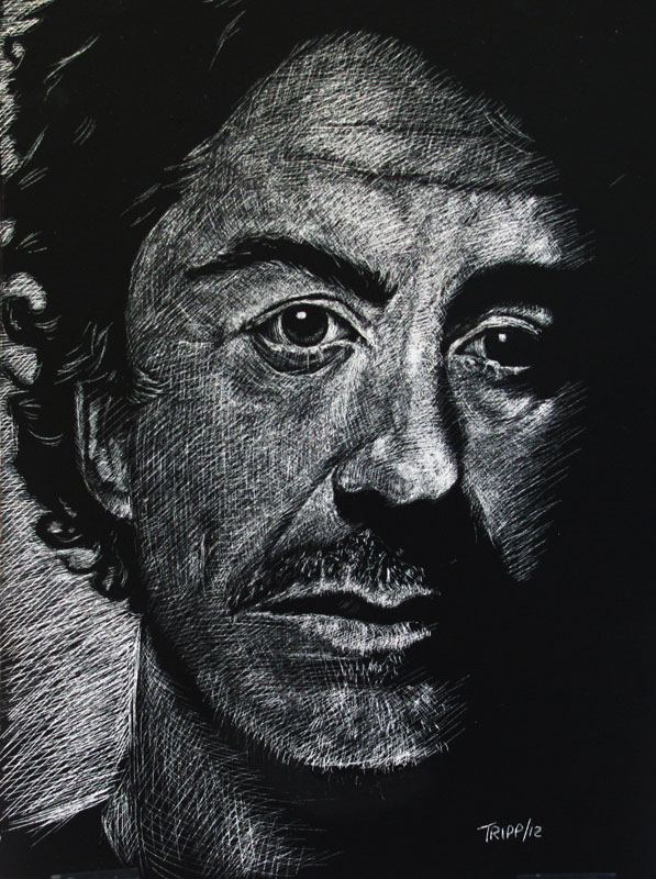
Then, on a whim, I tried chalk pastels on black paper and BLAM!  I fell in love all over again.  I must have churned out twenty pictures in that first week, I was so excited to discover a medium that worked as well as digital to give the characters life, dimension and rich, eye popping colours.

Add that to the recenty discovery of the pastel pencils, and I was an instant fan.  BTW, the brand I prefer in the pencils is the Pitt Pastel by Faber Castell.  Don't use Conte!  As a brand, Conte are fine, but they are made from a different substance (oil base) and you cannot mix them with the chalk.
Chalk is also a great medium for drawing tentacles. ;)  Using different types of paper can also yield interesting results.  I did this one on brown craft paper.  Sadly, I thought I'd brought my pencil crayons with me, not my pastels, and it took a good five minutes for me to figure out why my pencils outlines were smudging so much. durrr
TL;DR  Pastels are fun!
Good night!