Tuesday 31 May 2011

Pastels

Chalk pastels are hands down my favourite medium to work with.   My first experience them was less than stellar because I'd bought a cheap set and they seemed to scratch the paper as much as lay any colour down.  I was also taken aback by the mess.  Now that I'm a seasoned arteest *g*, I keep a dishtowel on my lap for frequent finger wiping, and a damp sponge nearby for when I really need to clean my hands off.
Blending is a large part of the way I draw, and that's probably why I love pastels so much.  They are also VERY forgiving.  Don't like the way something turned out?  Wipe it off and draw it again!
It is also very exciting to draw highlights ON TOP of darks.  As someone who only drew with pencils for a few years, this is a novelty that will never wear off.
Working with pastels is a very different process for me.  Probably because you first work in blocks of colour, blending in the tones, filling in the spaces etc, and THEN when you are almost done, you add the details.  If you look at my last post on pencil art, it works almost the exact opposite way.
I not super fussy about brand with the sticks.  I have some prisma colour, I have some  .. uh .. other stuff, and as long as they are from an art store, instead of like ... an office supply store, they seem to work well.  I generally purchase them individually, instead of in sets, because I don't always want the shades that they stick you with in them.
Speaking of sticks ... it was over a year of trying to make tiny little details with big chunks of pastel when I finally discovered that there are PASTEL PENCILS!  OMG!  What the hell?  Was I living under a rock?  Why did nobody tell me about these??
Talk about allowing lots of tiny details.
And colour.  Let's talk about colour!  I am a total newbie to the world of colour.  When I first fell in love with Megamind and joined the fandom, I felt like I didn't have anything of quality to contribute, because I sucked at drawing digitally, and uh ... the characters were CREATED digitally.

Then, on a whim, I tried chalk pastels on black paper and BLAM!  I fell in love all over again.  I must have churned out twenty pictures in that first week, I was so excited to discover a medium that worked as well as digital to give the characters life, dimension and rich, eye popping colours.

Add that to the recenty discovery of the pastel pencils, and I was an instant fan.  BTW, the brand I prefer in the pencils is the Pitt Pastel by Faber Castell.  Don't use Conte!  As a brand, Conte are fine, but they are made from a different substance (oil base) and you cannot mix them with the chalk.
Chalk is also a great medium for drawing tentacles. ;)  Using different types of paper can also yield interesting results.  I did this one on brown craft paper.  Sadly, I thought I'd brought my pencil crayons with me, not my pastels, and it took a good five minutes for me to figure out why my pencils outlines were smudging so much. durrr
TL;DR  Pastels are fun!
Good night!

Saturday 28 May 2011

Graphite Portraits

Graphite pencils are a wonderful medium to work with.  They're cheap, they last a long time and you can put them down, do a diaper change, and pick right back up where you left off.  No muss, no fuss.  That is probably the sole reason I worked almost exclusively in graphite for the first few years as a fan artist.

My pencils of choice are Lyra Titan woodless.  I usually sketch with an HB, shade with the 4B and then fill in the darker spaces with the 6B.

(These are just pictures off the internet, btw, I was too lazy to take pics myself.)  I really like the kneaded erasers, although I'm not fussy about brand. 

And for blending large areas, nothing beats papertowel.  I'm quite fond of the Kirkland brand, but that's probably just because that's the type I have hanging around the house.  I find it better than kleenex or toilet paper, because it doesn't shred and leave little bits lying around.

I also use a little make up brush for blending the smaller areas.  I don't have a picture, but it's the little foam q-tip type thing that you get when you buy eye shadow.  You can buy them on their own from Wal-Mart for a buck or two.

I learn a lot by seeing how other people work, so I thought I'd post up a couple of WIPs (works in progress) that I've made in the last couple of years.  Generally, I"m terrible at stopping and taking photos, so the fact that I have a few of these is pretty amazing.

I start by sketching out the subject at hand.  No, that's a lie.  I start by finding a great reference photo.  I'm not a good enough artist to just draw from my head (at least, in a realistic fashion) and the better the ref photo, the better the finished product.  Anyhoo, I sketch out what I'm going to draw before I begin shading.  I've found over the past few years, I'm less careful about the initial sketch that I used to be.  I'm getting a bit better at being less rigid.

I'm sure this is terrible form, but I pretty much always start with the eyes.  That's kind of like eating desert before the main meal, but to me, the eyes are the most important part of a portrait and if they don't look good, there's no reason to keep going.
This picture was my first time drawing Hugh Laurie (House) and I wasn't even very familair with the show, but he has a cool face, so I wanted to draw him.  Notice on this pic, the shading on the nose.  It's very dark underneath, and it's shaded above too, but there's a highlight on the bottom edge that really makes it pop.  This isn't something I made up, it was part of the ref pic.

The initial sketch had his nose and chin drawn way too long, so I've shortened them up considerably. (before drawing them in dark.)  A craggy, wrinkly face like his is easier to draw, than say, his co-host RSL (Wilson), who has lovely, smooth features.  I find that faces with well defined landmarks, like wrinkles, scruff, scars and folds help me to determine where I am, in relation to the rest of the face.  the more landmarks there are, the more I know if my proportions are correct.
Here's another example of the EVIL HAND.  Again, notice the highlights on each side of each finger, that really define them and give them dimension.

The blue mark on the bottom of this one is where my original sketch had the bottom of his chin.  The dude does have a long face, but this would have been a disaster!  Also, I suck at backgrounds, but shading in the side behind the highlighted area on his face makes it stand out more.

And here's the fnished product.  I wish I had specific advice on how to draw the different details, but I really don't.  I really just try to draw what I see.
Here's a couple of tips that don't really apply to this drawing, but apply to ALL drawings.
1) Never draw a straight line.  At least, not on something that occurs in nature.  Even lines that appear to be one thickness and arrow straight are generally more organic than that.  Take, for example, his nasolabial folds.  When I first started drawing, I probably would have just drawn them as lines, but even where they are deepest, say by his mouth, they still create shadows that blend in at different values, and they're not as straight as they first appear to be.

2)  Your eraser is not just for fixing mistakes.  I use my kneaded eraser as a drawing tool.  I picked out bits of beard to create highlights, I cleaned up lines, I pulled the light spots out of his eyes to make them more .. liquidy, and added the shine to his hair.  I probably use my eraser as much as I do my pencil.

3) Draw in the direction that you are going.  Wow, that was badly worded, but hopefully you get my point.  Look at his suit jacket.  The shading lines move in the direction that the material moves.  It's counter-intuitive to shade in lines that go against the grain of the drawing, unless you're doing it on purpose, for effect.
Here's a WIP of my son, Harrison.  Click on these to get a larger, more detailed pic.
Oh!  Another tip: DON'T BE AFRAID OF DARKS!  I've seen lots of people who are great line artists, who wimp out on the shading, and it really makes their art look crappy.  A really great picture should have all of the values.  The darkest darks and the lightest lights.

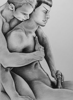
Good old Snapey-poo.  I owe all my artistic talents to him, because it was a desire to draw a passable Snape that motivated me to pick up a pencil in the first place.  But that's for a different post.

TL;DR  PENCILS ARE FUN!

Thursday 26 May 2011

Porn!

Many times I've been asked, "Why the hell is everything you draw porn?"  Other people ask, "Why the hell is everything you draw GAY porn?"  Both are valid questions, which I will answer here.

BECAUSE I LIKE IT.

I don't like ALL porn.  Pizza delivery guy with the suprisingly large schlong is not really my cuppa, but hey, if that's your thing, and you want to draw the Dominos guy doing the nasty, then good for you!  My porn generally features whatever fandom I'm currently obsessing over, and occasionally I'll go back and visit old fandoms and sex them up too.

Another reason that I like drawing people (or in some cases animals) having sex is because it's funny!  Even funnier if you know that the title to the above drawing is WHO'S YOUR PLATTY?   The minute I saw these two interacting, I just KNEW they were doin' it.  And why not?  They're both single, consenting adults .... and ... platypus'sss.

To be honest, I like fluff as much as I like porn.  Two people being kind and supportive and caring with each other is as much of a turn on as anything else I've come across.  And add a penis(or two) to that mix and you multiply the schwing factor by six!
Remember that kid from Superbad, who was always drawing penises?  That kid is me.  Except I'm a woman, and I'm all grown up. (at least chronologically).  I have always been mesmerized by teh gey, even as a kid.  My first memory of being all "OMG WOW GAY!" was watching Three's Company, and getting a bit too excited when Jack Tripper had to pretend he was light in the loafers, so that his landlord would let him live with Janet and Chrissy.
Wow.  It occurs to me that I've never drawn a picture of John Ritter.  I should really remedy that.
Also, sex is fun.  Drawing sex if fun.  Looking at pictures of people having sex is fun.  And let's face it, smutty drawings get way more attention than g rated ones.  I draw those too, of course, but I"d be lying if I said I didn't care about comments. 

My obsession with Megamind/Metro Man is one not shared by many, so those drawings tend to garner less attention, than say a picture of Snape and Harry, which has legions of hardcore fans, but I will continue to plug along, drawing what strikes my fancy, and hopefully there will be people who can share my excitement about the pairing, enjoy the artiful play of colour and shadows, or at the very least,

find something they can fap to. ;)

Saturday 21 May 2011

What's So Damn Funny?

Humour is very important to me.  Being funny is a great way to become my best friend, my favourite teacher or even to get into my pants.  For realz.  My first husband was a stand-up comedian.  THE MARRIAGE WAS A JOKE.  Ba dum dum.


No really, trufax.  I've always crushed on funny guys.  To me, Bill Murray is sexier than Brad Pitt will ever be.  Sadly, funny does not make a good husband, so we parted ways. 

My new husband is funny, but also responsible and employable.  But enough about my life choices, let's talk about funny as it applies to art.

Generally, to ellicit a laugh, you need a premise, a set up and a banana peel surprise.  Sort of a bait and switch, but this can be difficult with a one panel drawing, especially without dialogue.


Much of my humorous art is parody.  Drawing something funny is easier when someone else has done the premise for you.  If you understand the world of Harry Potter, and know that Doloris Umbridge is a castrating bitch, it's easy to put her (or someone else) in a situation with her that is funny.  And naked is alwasy funnier!

It also helps if you can empathize with the characters.  We all feel a bit like Dumbledore's wand here.
Barfing kittens can't hurt either.

Knowing what a port-key does is tantamount to understanding this one.  I like this one because the funny part hasn't happened yet.  IT HAS HUMOUR POTENTIAL.  We all have sex, and we all don't EVER want our mothers to see us doing it.

Putting people in unlikely situations is fun.

And having people do things that are against their character can elicit a laugh.  I honestly don't know why naked Abe Lincoln is so funny, but this quick doodle I made never fails to crack me up.

Getting caught doing something that is totally IN your character can be funny too.  Nobody could love Gilderoy Lockheart as much as himself.

And Evil Scientist/Platypus sex is the pinnacle of funneh.

 Well, to me, at least.  But I have the sense of humour of a twelve year old boy. ;)


Bottom line, what I find funny, you may not, and vice versa.  But I'm Canadian, and we certainly have our own special brand. ;)

Friday 20 May 2011

The Forty Things We Share


Fingers and toes.  Hands and feet.  The bane of many artist's exsistence, and yet, they don't often give me trouble.  (except, if you check my last post, I seem to have *cough* given Metro Man two  right hands.  durrr)

I'm not great at drawing hands without references, and I've been known, on long boring plane rides to use my camera phone to photograph my own hands, so that I can draw them properly.  Sadly, I have ugly, chubby, short stumpy hands.  They work well, the've given me hours of pleasure ;) but they are SO not photogenic.  I also make my husband pose as a hand model for me too.  He has nice hands.  But it really doesn't matter, I can ugly up fingers, or lengthen or shorten, or even change the colour, if need be.

Yup, Dumbledore has hubby's hands!! :D
Hands add so much to any picture.  They are very expressive, and can often convey the 'truth' of a picture, when the main subject matter is not so forthcoming.  Sometimes they are the ENTIRE picture, and sometimes they just help to 'ground' it.

 Even when they are just a small part of it, I often get compliments on the hands, or the placement of them, or *gasp* a wedding ring, when two characters are not in a canon relationship. :D

I wish I could say that there is an easy trick to drawing them, but there isn't.  When I don't have a reference, drawing them as cylindrical shapes helps, and varying the lengths and angles of each etc etc, but my non ref hands are pretty shitty, so I shouldnt' be giving advice on them.

 Draw what you see.  Don't worry that they're hands, they're no different than a nose, or lips or a pair of ears.  They're just shapes and shadows like the rest of the body.

And feet!  Oh god I love drawing feet.  (I suck at drawing shoes, however, but I'm working on it.)
Snarry feet was one of my most popular drawings evah on deviantArt (until being forcibly deleted for PORNOGRAPHIC CONTENT of a minor.)  But that's a totally different post, trust me.  And looking back at this piece, it's really pretty crappy, compared to any of my new stuff, but it tells a story.  A sexy story!  And it sort of IS pornographic, even though all we see are toes and ankles and heels, but they promise so much more.  And that one curled big toe tells more about Snape's true nature (or what  I'd LIKE to believe about Snape's true nature) than any curled lip or eyebrow.

And like hands, feet add so much detail  and expression to a drawing.

Bottom line, don't fear them, embrace them!  Stretch yourself as an artist, and you'll improve from it.